Forums » General
Actually mih, it would be 3 small ports, all firing from the 3 wings, no matter which Bsg you are taliking about, with a hard point too for missiles.
Yeah, I guess one might have the two front s-ports for the flechettes/KEWs and an s- or l-port a bit further back for rockets or missiles...
Also, as far as the new series goes there are two kinds of Vipers -- the MkIIs, which have only two KEWs on the wings, plus missiles/rockets, and the MkVIIs, which have three KEWs and missiles/rockets, so it does matter a bit -- more which model of Viper you're talking about than the actual series. :)
In any case, I think the thing that would make the Warthog a 'BSG Viper' would be having two s-ports that were not front/back, but left/right.
Forget where the guns go, all I can think of when I see it is BSG, and I've never even watched BSG.
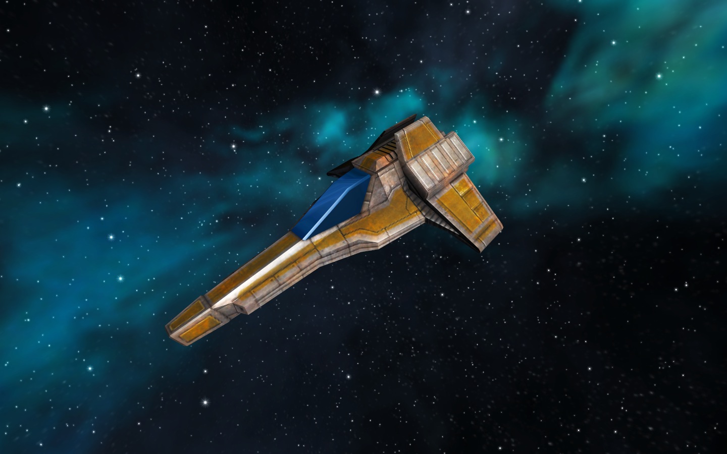
Of course it looks lame now because it's very very incomplete, but I kind of see where it's going and the design has potential. It's the ugliness of our current Warthogs that I like, and I think that's what Fediroc is thinking, since basically those are an airplane built around a big gun.


Of course it looks lame now because it's very very incomplete, but I kind of see where it's going and the design has potential. It's the ugliness of our current Warthogs that I like, and I think that's what Fediroc is thinking, since basically those are an airplane built around a big gun.


http://youtube.com/watch?v=sALiuWg_I1k
i want that in vo /offtopicness
i want that in vo /offtopicness
The current VO Warthog is already designed around its weapons, the long, tapering body matching its in-line setup.
I'd actually like to see a 'hog Mk II variant that had no s-port, and an integrated (non-removable & non-replaceable) Mega Posi blaster with some sort of bonus attached to it (upped damage or lowered energy consumption). Add some more cargo, shave off some of the armor and mass. Make it a Corvus special ship, unlockable via mission + standing or something. It'd make a vicious trader chaser, which the 'hog Mk II already is. Scrap the CV, as it's a useless pirate ship: sucks for chasing, sucks for hauling.
I'd actually like to see a 'hog Mk II variant that had no s-port, and an integrated (non-removable & non-replaceable) Mega Posi blaster with some sort of bonus attached to it (upped damage or lowered energy consumption). Add some more cargo, shave off some of the armor and mass. Make it a Corvus special ship, unlockable via mission + standing or something. It'd make a vicious trader chaser, which the 'hog Mk II already is. Scrap the CV, as it's a useless pirate ship: sucks for chasing, sucks for hauling.
Sweet. I got to see a couple A-10s on a firing range do drills with live ammo, it's really impressive. It sounds like they're farting really loud (like that video), and some dummy target just disappears. There's so much recoil they have to go into a slight dive to fire it or they stall.
Personally, I don't think the A-10 is all that ugly, really, it's just called that. In my opinion, it has its own style. And while I agree with Lecter in that the current hog design in VO is good, I'd certainly be interested in seeing what Fediroc can turn out this time.
Perhaps the design could be altered so that both the L-port and s-port weapons do not fire from below, but above the cockpit? Much like the Mil Mi-24 (Hind) helicopter.
I wouldn't get rid of the CV, though, it is the most readily-available serious fighter in Sedina.
Perhaps the design could be altered so that both the L-port and s-port weapons do not fire from below, but above the cockpit? Much like the Mil Mi-24 (Hind) helicopter.
I wouldn't get rid of the CV, though, it is the most readily-available serious fighter in Sedina.
Give it to that other corp, then.
Who? Aeolus? Ineubis? Xang Xi?
??? The Hind has a few weapon configs. All have pylon-mounted weapons, but the gun armament is either a turret(directly below gunner) or a fixed twin-cannon setup to the starboard side of the craft, again, low.
Okay Lecter, I'll bite.
"We don't need to. First, that design looks great. Second, it's not a design that originated with BSG. Third, the basic shape itself isn't protected by copyright."
Okay, so just because it's not copywritten, we shouldn't strive to have original-looking content?
"Also, the 'Hog Mk II is anything but slow at 220 m/s with a 50 drain."
So, basically you're saying that the evolved versions of a slow chassis should dictate the design of the base chassis(which historically would have been the FIRST one)
"And now that I think about it, that fugly thing looks an awful lot like the new Wraith."
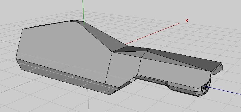
Think more. We're talking about a forward fuselage here. The rear half isn't even represented by three faces and a stock material. The front fuse of my design has about a 15% design commonality with the Revenant. Want to take a guess at the design commonality of the current Warthog to a certain iconic fighter design of recent revived fame? I can appreciate that it was created without knowledge of of the Viper. But people looking at screenshots deciding if they want to give the trial a go don't know that. I certainly jumped to the blatant design copy theroy when I first saw the 'hog two years ago, and it was a major factor in me deciding not to join at that time. Want to bet that I'm not the only one?
"Give it to that other corp, then."
Give it to whoever you damn well please. It's all in your head. But this oft-mentioned factoid is not: In all likelyhood, this or any of my designs will not ever grace your screen in full real-time rendering in VO. Maybe some other game, sometime in the future, -maybe-.
Why do I model this way, with the interfacing with THIS playerbase? To give YOU guys the opportunity to show the devs what style of art you'd like to see in this game once they decide to revamp the graphics. In other words, I'M TRYING TO BE NICE. The least you could do is post constructive criticism(even if it's alongside scathing reviews of current work, as long as you give me SOMETHING to work with besides "I don't like it.").
Another thing. Let's say the reason you don't like my style of ship and refuse to give constructive criticism is due to the fact that you don't like the idea of your favorite ship getting changed. You're familiar with the layout, familiar with every nook and cranny of that ship. I feel for you. I really do. But ask yourself this: What causes more damage to the game as a whole: Outdated art flying next to current art, confusing new players and possibly turning them off before they ever download the game(screenshots are included in most reviews), or forcing old-guard players accept that they *might* need to EVOLVE new tactics and techniques in order to keep this game current?
fin
Slow down and look around Fed. There are troll tracks everywhere.
Yeah, Lecter is a notorious troll around here; not nearly as entertaining as Gavan or ananzi, but a troll nonetheless. Thusly, anything he says should be taken with a pinch of salt; especially when it looks like he's being serious.
Don't worry Fediroc, I agree with you 100%, and a lot of us appreciate what you're doing and understand it.
Hm. Then I misread (about the Mi-24). In any case, weapons mounted above the canopy would be interesting :)
How about a mob-style ship where you fly up next to someone and roll down the window to shoot?
Should we strive for novelty for its own sake, while sacrificing asthetics?
You chose not to play the game because one ship looked a lot like a ship design featured in BSG and multiple other sci-fi creations? Gee, you're... strange. One ship that looks like a basic space ship design... yeah, that's definetly going to turn everyone off due to VO being a BSG rip off!
VO always has--and likely always will--used one mesh for all variants. I'm not a huge fan of this, but I understand why. It also makes sense, since the chassis isn't slow (as you assume without much reason aside from you feel like it should be). The same frame will perform better or worse depending on how it's equipped, but you need a fast frame design if *any* variant will be fast. The Hog has a fast frame because some of the variants have the equipment to make for a fast ship. The moth, for example, need not have a fast looking frame. Maybe you should try designing trade ships to help us... do whatever it is you're trying to help us do.
15%, huh? That's an interesting number; very specific. Also, very irrelevant. How does that % compare to the Viper, really? Have a look: and compare with
  Keep in mind that the Hog came out before the new BSG, so it's the old Viper to which you need to compare the Hog.
Either way, what you've shown us here

looks a lot like the renevant's guppy shape... sort of how the Hog and the Viper share the same basic shape/layout, but really share no details. I guess you're not striving for original content across the board, huh.
My comment about the other corp. referred to transferring the CV to Xang Xi (my thanks to vIsitor), so that corvus could have something more appropriate for a pirate ship. It had nothing to do with these bizzare little pictures over which you're laboring. Try to keep up.
If your goal is to provide asthetic models for players to tell the devs a direction to go, my comments are pretty useful. Your stuff so far looks strange or already in the game, I've told you why I think that's the case, and I've said I find those factors make me not want stuff in game looking like this shit.
Clearly you know how to model designs and you randomly spent a lot of time on this. Thanks, I guess. What else do you want, a cookie? I'm not going to sit down and explain how I think you could make these better. In point of fact, I don't think you can, at least not in so far as "better" means "a good fit for VO." I'd rather have somewhat basic ship designs than a bunch of bizzare looking creations that look like someone said "Gee golly, no matter how dumb it looks, my stuff is gonna look really different!"
You chose not to play the game because one ship looked a lot like a ship design featured in BSG and multiple other sci-fi creations? Gee, you're... strange. One ship that looks like a basic space ship design... yeah, that's definetly going to turn everyone off due to VO being a BSG rip off!
VO always has--and likely always will--used one mesh for all variants. I'm not a huge fan of this, but I understand why. It also makes sense, since the chassis isn't slow (as you assume without much reason aside from you feel like it should be). The same frame will perform better or worse depending on how it's equipped, but you need a fast frame design if *any* variant will be fast. The Hog has a fast frame because some of the variants have the equipment to make for a fast ship. The moth, for example, need not have a fast looking frame. Maybe you should try designing trade ships to help us... do whatever it is you're trying to help us do.
15%, huh? That's an interesting number; very specific. Also, very irrelevant. How does that % compare to the Viper, really? Have a look:
 Keep in mind that the Hog came out before the new BSG, so it's the old Viper to which you need to compare the Hog.
Either way, what you've shown us here

looks a lot like the renevant's guppy shape... sort of how the Hog and the Viper share the same basic shape/layout, but really share no details. I guess you're not striving for original content across the board, huh.
My comment about the other corp. referred to transferring the CV to Xang Xi (my thanks to vIsitor), so that corvus could have something more appropriate for a pirate ship. It had nothing to do with these bizzare little pictures over which you're laboring. Try to keep up.
If your goal is to provide asthetic models for players to tell the devs a direction to go, my comments are pretty useful. Your stuff so far looks strange or already in the game, I've told you why I think that's the case, and I've said I find those factors make me not want stuff in game looking like this shit.
Clearly you know how to model designs and you randomly spent a lot of time on this. Thanks, I guess. What else do you want, a cookie? I'm not going to sit down and explain how I think you could make these better. In point of fact, I don't think you can, at least not in so far as "better" means "a good fit for VO." I'd rather have somewhat basic ship designs than a bunch of bizzare looking creations that look like someone said "Gee golly, no matter how dumb it looks, my stuff is gonna look really different!"
I'm going to take Whistlers advice. Nuff said.
"How about a mob-style ship where you fly up next to someone and roll down the window to shoot?"
Sounds sort of like how they thought air combat was going to be before they actually tried it.
Personally, I'm a fan of the cargo ship with the cargo bay converted to a hangar concept. Just paint FREE CANDY on the side, and you're set. Bonus points for shag carpet and heart-shaped viewports.
Yes, this design is heavily influenced by the A-10 Warthog model. Or maybe the B-25 that has the centerline-mounted 75mm tank gun. Who knows.
I really, -really- wish there was external ordinance in this game. That'd really open up the possibility of some very interesting designs.
I think there'd need to be some major tweaking to how graphics are handled at a very basic level to do external ordnance (that's the right spelling, by the way, most people miss that one). It would be super cool, though, and make wings actually make sense in some cases in space.
Lecter, I still see resemblance. Of course they're not identical, definitely not similar enough for copyright issues, but their major features resemble each other.
I've never done any 3D rendering, and I haven't sketched anything in years, but maybe I'll whip up something inspired by the A-10. Seriously, ignore Lecter unless he's talking politics. At least just ignore his last couple comments. If you enjoy making models that you know won't go anywhere, I at least enjoy looking at what you come up with.
Indeed, its often quite difficult for programmers to make external ordinance look good, or even present. Modern military flight sims usually handle this a number of different ways.
My personal favorite way is to treat each munition as a physical individual, and only attached to it's launching parent. You get that cool slight movement when you really pull gees, and the launch is handled by a "unattach, engage engine" line, which makes launches perfect, visually.
From what I understand(which very well may be flawed), this requires a very stout physics engine. Air combat sims usually boast such an engine, with gravity, real-time drag, great momentum handlers. Unfortunately, flight sims seem to have been losing their focus on flight engines, and have been focused on pretty graphics on boxes. This, of course, creates more sales. Two of the best modern flight sims I have ever played were F/A-18 Hornet and A-10 Attack!, both of which are very long in the tooth.
Anyway, I've been sufficiently distracted from the Centurion(and it's rather annoying cockpit issue; I feel there is something wrong with it, but can't think up a better design) by the Warthog. I'll create a new thread to follow that development.
I don't like the cockpit either. I would make the top of it a bit more angular to match or echo the pods on either side of it, and perhaps extend the front in an angular/faceted manner. Perhpas it could have a hint of a "fin" like the pods. The bright blue pulls the eye off the contours - maybe tone it down or make it black.