Forums » General
This is very much out of the blue, and very cool:
http://massively.joystiq.com/2012/02/17/some-assembly-required-a-look-at-vendetta-online/
http://massively.joystiq.com/2012/02/17/some-assembly-required-a-look-at-vendetta-online/
Not bad, nice to see VO getting some favorable press.
Nice article, hope he subs. :-)
And I'd really love to tell you about endgame, but ...
Yeah, about that.
Yeah, about that.
really nice write up. WTG
Great article. Hope he sticks around.
Glad to see the good press.
Not to be a huge, hopeless fanboy or anything, but why is everyone always so down on VO's graphics?
Granted, the game has no room for radically colored fauna, or even gray and beige stacks of sandbags, so those avenues of making "innovatively beautiful graphics solutions" are somewhat lost. Still, VO features the best looking rocks ever made, reasonably high poly-counts for ships you're only ever going to see from an arms length away and hi-res textures with dudes in sombreros.
What sort of wildly beautiful space games are these people playing that make VO look drab by comparison?
POST PIX PLZ
What sort of wildly beautiful space games are these people playing that make VO look drab by comparison?
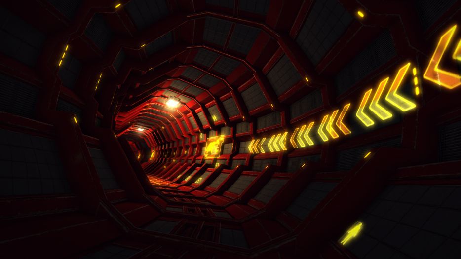
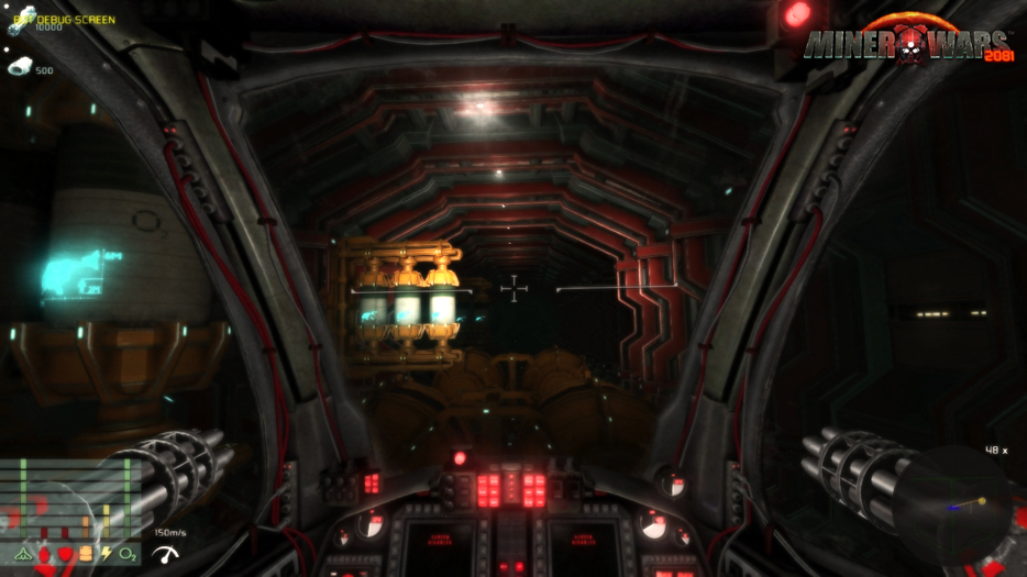
I don't really want to distract from the topic of this thread, but while VO's graphics aren't bad they aren't really up to 2012 standards either.
Miner Wars:


Black Prophecy:


I don't really want to distract from the topic of this thread, but while VO's graphics aren't bad they aren't really up to 2012 standards either.
Miner Wars:


Black Prophecy:


Yeah. We may not be state of the art. But we still have some cards to play yet, on the environmental graphics area. Engine-related stuff. Lighting and shadows. More densely packed sectors.
Plus, the upside to graphics is that it's not really that hard to drop in new assets. It's not like gameplay, where it's all linked together like a giant Jenga tower. Art assets you can just say "hey, let's make a new rock. Ok here's the collision model we'll stick with, here's the new rock, ship it, done." and it magically appears in all the same places and makes them look better.
Part of my overall plan in building up more cash reserves for the company is to update our art assets. It's on the radar.
And I agree, the game doesn't look bad. There are some bits we can tweak to make it a little less jarring. Blurry force fields on launch and menus that were intended to contain logos that were never made. But I've been periodically trying to polish up some of the rough spots when I can.
Sure, just shatter our graphic dreams to hell an back Slime.
Devs, fix this.
Devs, fix this.
Well the only graphic elementz i am starrin' at all day is the worm hole and HUD target indicators.
But if improving graphics means more fresh food, go fer it devs, still let the option vo run on my junk graphic linux box, cos i aint puttin' time and money to upgrade it : )
PS: Black prophecy may look nice but is boring as hell to play and Miner Wars is still soon(tm) me thinks, but long time since i has checked on me alpha pre ripoff build.
Re: slime
The only real advantage I see in those pics is what appears to be dynamic lighting (shadows cast by asteroids, a floodlit passageway), and as I understand it this may be on the horizon for VO.
I am with the crowd that views gameplay as an order of magnitude above graphics on the importance scale. Not that VO needs to look "retro", nor does it. I think you devs have hit the mark just about right, for the time being at any rate.
/2c
No kidding. All those pictures have going for them is "Oooo, new ship!" and "aaah, bright lights in dim corridor!"
Meanwhile, Black prophecy is pretty clearly working with a collection of maybe six different backdrops they hide behind brown fog, and Miner Wars isn't working at all, and that with asteroid ugly enough that they actually look better in wireframe than rendered.
Not to mention copyright infringement.
PS: Sorry for the rabid fanboyism
Regarding end-game content,
I see everything that has yet to be achieved as end-game content. For me, this includes:
Building a cap ship
Reaching Combat License 15 (1.75 million XP, enough to level up one-hundred newbies to Combat License 4)
Earning some more badges, like:
- Master Prospector (Completing all 120 Prospecting missions)
- Intermediate Trader II (50 million credits in profit)
- PvP specialist (1,000 PKs)
- Silver Mentor (15 positive mentor ratings)
Completing the Mission Tree I'm writing in the PCC
Designing and hosting a successful new event
And the thing is, that is just this one player's perspective; a narrow slice of all that is accomplishable within VO. End game content is never truly finished, it's a moving target, like graphics.
There are several endgame areas that are planned, which are really still in the "testbed" phases. The current testing includes Deneb War, dynamically conquerable (and ownable) stations, and capship construction and ownership. There are some other important elements that haven't entered testing yet, but then the more critical aspect will be taking these disparate building blocks and pulling them all together in something interrelated and cohesive. That's the.. vague few-sentence description, anyway.
Those screenshots above are all pretty, but it's mostly from having recent, graphically-intensive assets. There's actually almost nothing in there that we couldn't currently do, with the existing engine. And, incidentally, the only shadowing I see in there is in the planetary ring. I don't see any self-shadowing on objects at all, just light/dark and lots of good use of specularity maps. Nor do I see asteroids casting shadows on one another. The big flat capships are kind of interesting, they seem to be created much like our stations.. built as components from surface textures, rather than real per-object textures. It makes it much easier to make huge stuff that's detailed that way, but on the other hand you lose much unique-ness per object, which is why they all kinda look the same. Basically the same tack I was taking with the capship-station art before I had to.. stop working on that and do other things. So, good that that validates my own thinking, I guess?
Anyway, kudos to all those other games. But we aren't technically far shy of them, although we don't have the artists to produce a bunch of new assets yet. Oddly, though, I don't feel very off-put by the disparity in graphics; we can get there when we choose to, and for the moment I'm still convinced that gameplay is the better investment of our time. And then there's the fact that our game scales to mobile devices.
As a new player I'd say the UI needs working on the most, its rather dated looking and not very easy to navigate, especially when inside a station.
Black Prophecy is pretty no doubt. I actually thought it was going to kill this game for me, but I gave it a shot and came back to Vendetta.
One of the worst grinds I've seen in a space shooter. To level up, you run the same missions over and over again which are scripted and offer little variety.
Also, the levels are much more important than in Vendetta. You get better versions of the same equipment at higher levels. So unlike Vendetta where a lvl 5 can compete with a lvl 10, a lowbie in BP is at the mercy of higher level players, making the grind even more necessary.
So, yes it's pretty. But Vendetta still has a solid leg up on it in terms of gameplay. That and their endgame is about as lacking as ours =)
we still have no cockpit, granted that'd suck on most mobile devices. But on a 24" monitor, you've enough space for that.
and on the one hand you talk about how easy it is to add new content and yet, we've only a small asset of ships and weapons.
and on the one hand you talk about how easy it is to add new content and yet, we've only a small asset of ships and weapons.
and on the one hand you talk about how easy it is to add new content and yet, we've only a small asset of ships and weapons.
I think you read that wrong, D. He's saying gameplay is more important than art assets for the time being. Personally, I think there are plenty of ship models, but I've only been playing for about a hundred months, so who am I to judge?
I think you read that wrong, D. He's saying gameplay is more important than art assets for the time being. Personally, I think there are plenty of ship models, but I've only been playing for about a hundred months, so who am I to judge?