Forums » General
Posted a changelog, mostly a lot of relatively minor UI stuff, but hopefully changed that will be well-received. Feel free to post feedback here.
God I hope HUD options does what I hope it does :)
You guys rock.
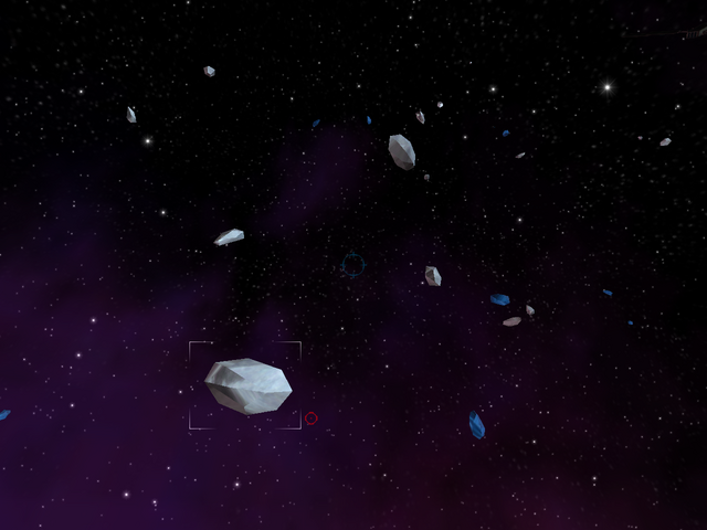
Need I say more:

next step guys: We need to be able to have custom configurable sets of hud options, so that we can go from full display to this with the flick of a button.

next step guys: We need to be able to have custom configurable sets of hud options, so that we can go from full display to this with the flick of a button.
Ok I'm starting to feel geeky.
But, the extended cargo slot shows when you jump into a sector if you have Show Cargo List turned off. And you can turn it on and off with O.
Kind of cool, but not sure if its what was expected.
But, the extended cargo slot shows when you jump into a sector if you have Show Cargo List turned off. And you can turn it on and off with O.
Kind of cool, but not sure if its what was expected.
how do we go about getting our skin packs to work without getting white boxes on checkboxes and the FA on throttle?
I think you'll need the new image data from Ray.
Whoa, sorry the new hud filled-in powerbar color is a little intense. Didn't realize it'd look like that.
Heh, agreed. =)
Actually, I like the current new powerbars and their fill. I really like the new HUD. Yay! (Oh, and thank you so much for giving us our jump chat back)
Btw, when you dock in a station, your mass is noted as 0kg until you do something to change it. Also, at least for me, the bottom half or third of the mass line in the station personal info box is cut off...
Btw, when you dock in a station, your mass is noted as 0kg until you do something to change it. Also, at least for me, the bottom half or third of the mass line in the station personal info box is cut off...
Yeah, I get the chop, too.
Didn't notice about the mass being zero.
Didn't notice about the mass being zero.
The bold radio style buttons are a great improvement over the tick boxes. Always nice to get up on a Saturday morning and see an update .
Cheers
Ecka.
Cheers
Ecka.
LostCommander/Demonen: what resolutions are you playing in, where you see the data chopped off? We'll look into the "mass 0" thing.
My screen is set to 1280 x 1024; I don't see a resolution setting in the graphics options, so I assume that is what the game is running in.
I like the new HUD options! Could we get an option to hide the powerbar and thrust bar, but keep the numbers? I also second the suggestion that we get toggle options, to toggle between two preset states. That would rock! You could have a flight mode and a combat mode!
1. I agree that the powerbar fill are a little intense. I liked their transparency in 1.6.12, the different colors just needed a little more contrast.
2. Hud configuration options menu = great.
3. I think the distance readout needs to be below its bar though. It's too easy to confuse it with distance to wh or storm exit right now.
Otherwise, the hud is very good. I have a few hours in a jet with a hud and one of the dangerous temptations of it was turning it up so bright that you didn't bother looking out the canopy anymore. The current hud is much dimmer than before and distracts less from flying...especially if you use the options to remove extra info. I like the idea of preset hud configurations for fighting/trading. Are there scripting commands that could be used for it? (/showcargo or something?)
there aren't script commands yet, but i can add them easily.
Sweet.
Uh... I tried turning off various things from the HUD (like that License display) and nothing did. This was on the Windoze version.
It says "mass 0" 'cuz when your in the station, it IS zero.
:)
Nice update, ray.
:)
Nice update, ray.